


Color Me Spring: Spring Trends for Men's Fashion 2015
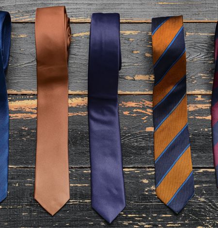
“En Plein Air” is the name of Pantone’s color collection for men this spring. These are the Top 10 color picks you will see this upcoming season. The name of the collection is translated into “In the Open Air”. Which could only mean that this spring it will be all about dreamy hues, calming colors and a sense of nature. Spring is the season when nature is revived from the winter’s chill. The color palette contains two shades of blues, greens, grays, and tans. The remaining two colors are accents of red and purple.
For this spring, utilize the versatility of the blues, tans and grays as a base for all your outfits. These colors you should already have in your wardrobe in varying shades. As these 3 colors are easiest to use when pairing with more vibrant combinations. Classic Blue is the easiest color to match with the other 9 colors. Dusk Blue, gives an airy feel, where as Classic Blue should be an anchoring color for bold contrasts. The grays this spring couldn’t be any different. Titanium has a masculine touch because of its strong and dark color composition. Glacier Gray however serves as a supporting color for high contrasting combinations. It is the perfect neutral to wear throughout spring rather than opting for white. Sandstone and Toasted Almond add some warmth into the mix. Spring is about nature and these tan colors already have names that sound organic. Toasted Almond is another perfect timeless color that is a sun-tanned neutral. Sandstone is much more warmer is described by Pantone as “rugged and woodsy”.
What’s spring without green? The two shades of green that will be popular this season are Treetop and Woodbine. Treetop is the very lush green that its name suggests the brightest newly grown leaves on peak of trees. Woodbine stated by Pantone described it as “a hue of foliage, grass and growing plants”. It is also considered a classic yellow-green that can be paired with varying colors. Add more variety to the springs color palette are Marsala and Lavender Herb. Marsala is a named after Marsala Wine, which makes it a deep warm red with brown undertones and serves as the main color inspiration this spring. This shade of red isn’t the typical bright reds you usually see for this season. It’s sophisticated earthy red. Lavender Herb is the wildcard in this color palette. This soft purple hue is feminine but mix it with neutrals to tone down the color.
For the best color combinations try these out as pairs or wear all three together!
Classic Blue, Marsala and Sandstone. Collectively, those 3 colors are best worn together and give a off a nautical color scheme. Dusk Blue, Glacier Gray and Treetop. The Dusk Blue and Glacier Gray will only make the Treetop Green be more contrasting. Woodbine, Lavender Herb and Titanium. In this combination, the Titanium is what tones down the Lavender Herbs pop of color as well as making it more masculine. Toasted Almond and Lavender Herb is another great pairing, remember neutrals with this color is best bet to go.


